Selected Work
By Paul Tomanpos, Jr.
Web-Based
Field Guides
Responsive Web Design
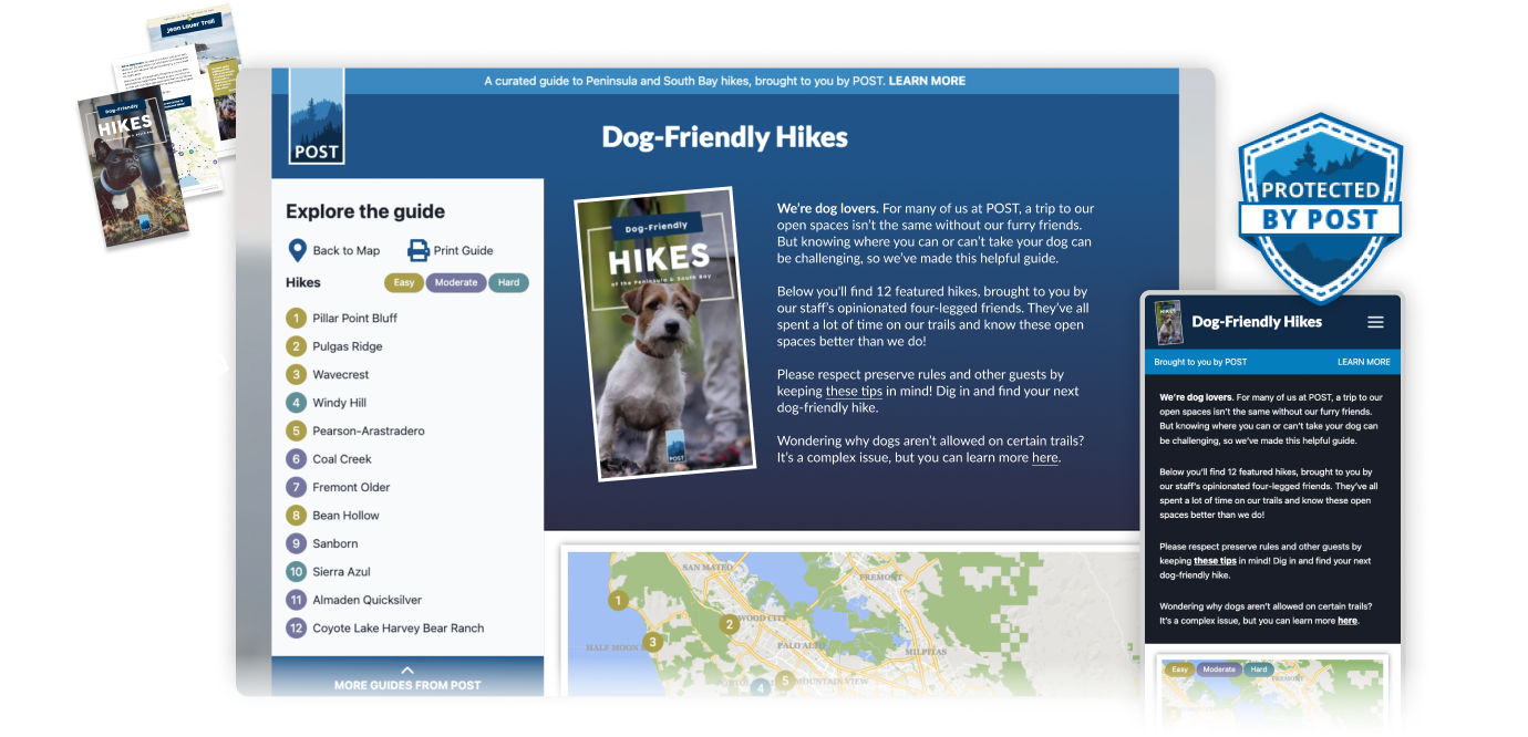
Peninsula Open Space Trust’s popular printed Field Guides — redesigned for modern, mobile audiences
Responsibilities
✓
UX/UI Design
✓
Graphic Design
Introduction
In my role as the UX-Designer and Visual Designer for the Open Space Trust’s Web-Based Guides project, I was tasked with transforming their printed Field Guides into an interactive, digital experience. The goal was to create a user-centered design that was mobile-friendly, reflecting the modern preference for digital over printed media. My main deliverables included high-fidelity clickable prototypes, a responsive design compatible with all screen sizes, a template approach for future guide creation, and a custom illustrated badge indicating hikes on land protected by POST. This project required a blend of user empathy, a thorough and flexible design approach, and creative problem-solving to ensure a successful outcome.
Skills & Methods by Phase
DISCOVERY
- Problem Definition with stakeholders
- Define User and Business Goals
- Develop Information Architecture for content prioritization
DESIGN
- Responsive Visual Design of mobile and desktop screens
- Hi-Fi Prototyping for accurate representation at hand-off
- New “Protected by POST” graphic asset
DEPLOYMENT
- Collaboration with dev teams to define interaction and UI details
- Produced final graphic assets for developers
User-Centered Design
Products should evolve to stay competitive and relevant to its users…so know the users.
To create an effective user-centered design, it was important to fully understand our target users. Our client had various qualitative and quantitative data showing that their existing printed Field Guides product was popular, but needed to evolve to digital version that was easier to consume as well as produce. I worked closely with their marketing team, asking in-depth questions to produce valuable insights into the preferences and behaviors of our users.
We discovered that mobile devices were the preferred method for accessing the guides, rather than the previously used printed PDFs. This understanding shaped our approach, ensuring that our designs were optimized for mobile use and responsive across all devices. By prioritizing user needs and preferences, we were able to create a more engaging and accessible experience for hikers and nature enthusiasts.
Knowing what it was that the client wanted to get built, the next step for me was to come up with a plan for design and development.
Web-Based Field Guides: Design Plan!
Part 1.
Content Analysis
Thoroughly understand the content of existing guides to design for its presentation.
Part 2:
Constraint Definition
What technologies will be utilized, and what constraints do we need to work within because of them?
Part 3.
UX/UI Design
Design the product that streamlines consumption AND production… and looks good too!
My plan for designing the new Field Guides. My expertise as a UX and Visual Designer meant a streamlined process for the client.
USER INTERFACE Wireframe Design
Designing the user interface requires a balance of creativity and functionality.
The task at hand was to create a new, intuitive & dynamic interface while maintaining the visually appealing and established branding of the organization–built in a way that can be “templatized” to streamline future guides.
New Medium = New Challenges
Going from a print-based medium to web-based may seem straightforward at first glance, however, vision for how the content would be laid out involved more than simply re-arranging the content for narrow screens.
Considerations:
- Stacking Order – Optimizing what content is primary, secondary, or unnecessary on smaller-sized screens. This means looking at and prioritizing existing content.
- Web UI Elements – Because of the interactive nature of the web, integration of conventional and unconventional UI elements needed to be considered for new user control and freedom. For example, secondary or supporting content can now be hidden behind horizontally scrolling areas, galleries and hamburger menus/navigation.
- Web-Based User Flows – A benefit of web-based products is that the user can easily jump to related or supporting content on different web pages (e.g. hike detail pages) and websites (weather and traffic websites). Appropriate UI and affordances need to be considered for this kind of interactivity.
- Responsive Design – Transitioning from a printed medium to a web-based medium presented several challenges, particularly in how content would dynamically display. There were interactive maps, clickable menu items, dynamic content that expanded or collapsed as needed, links to similar, additional and third-party content–all of which were new, because of the medium, and unavailable in its previous form as a printed document. I leveraged my experience designing web layouts to create flexible, responsive designs that could adapt to various screen sizes and orientations. This involved creative solutions to ensure content would wrap, stack, and reposition as necessary, providing a seamless user experience across all devices.

Template Design
Responsive design = responsible design.
The template approach I designed ensured that future guides could be created efficiently, maintaining consistency while allowing for customization. Dynamic layouts needed to be visually balanced and aesthetically pleasing even when accounting for variable content, typography, imagery, etc.
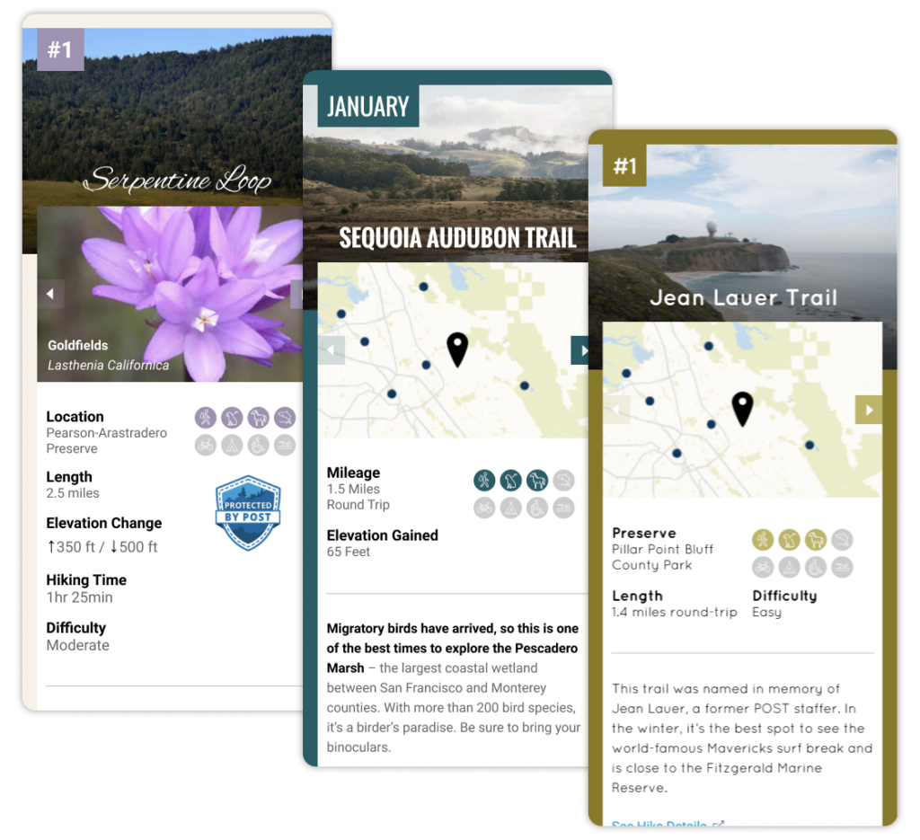
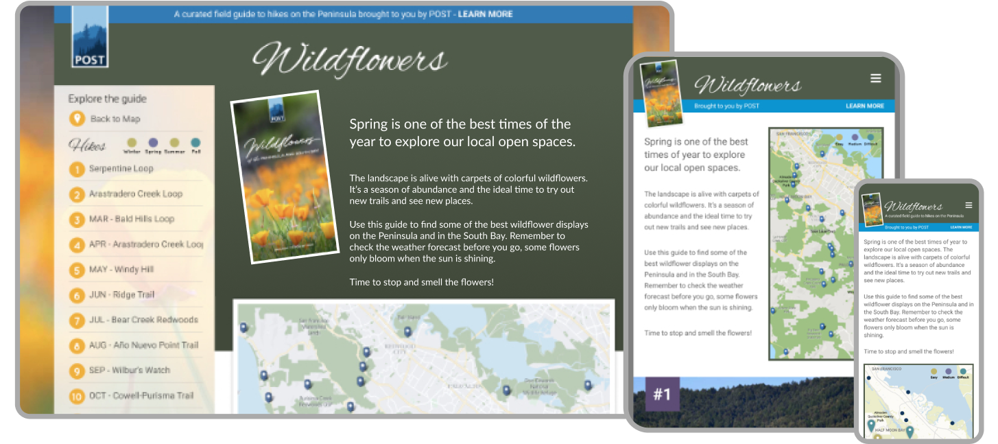
I assessed content, prioritized and presented variations to stakeholders to land on final designs. Responsive layouts change seamlessly across screen sizes.
Working together
Good communication across stakeholders and dev teams makes for smooth development!
A key aspect of the project’s success was ensuring that all stakeholders were aligned with the project goals and user needs. We held regular meetings to discuss the project objectives, progress, and share insights. These sessions helped to ensure that everyone had a thorough understanding of the goals associated with each audience and the layouts addressed all necessary features.
By fostering open communication and collaboration, we were able to create a shared vision and work towards common objectives, which was critical for the project’s success.
Collaboration was essential throughout the project. I worked closely with the development team to ensure the design was technically feasible and implemented correctly. Regular check-ins and open communication channels were established to address any issues promptly and keep the project on track. By fostering a collaborative environment, we were able to quickly resolve challenges and ensure that the final product was both functional and visually appealing.
The Benefits of an Iterative Design Approach
By adopting an iterative approach, with each check-in I was able to prioritize features and refine designs based on continuous, regular feedback. This flexibility ensured that the final product met the evolving needs of our users as well as the business objectives of POST.
The high-fidelity clickable prototypes I developed allowed stakeholders and the dev team to test and interact with the proposed designs, providing valuable feedback and ensuring buy-in from stakeholders at every stage.
A new Brand Asset
The motivations behind “make the logo bigger” can be addressed in many different ways 🙂
In addition to designing the revamped Field Guides, a separate yet related feature was necessary to incorporate into this product.
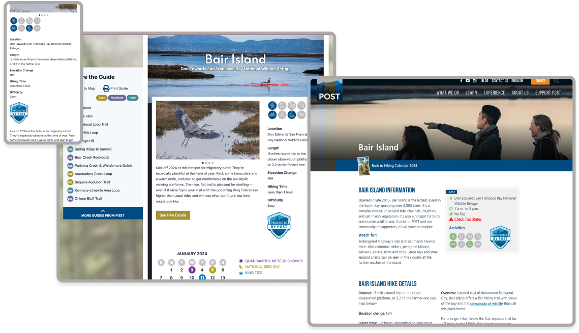
POST’s mission is to do the work of attaining legal protection of natural, open spaces for the public to enjoy, for generations to come. While their hikes and content was popular, they needed a way to make it more visually clear that the land’s access was largely due to POST’s work.
I designed a custom badge to be used throughout the website and on various print collateral to indicate areas protected by POST. It was designed in visual alignment with the POST brand and graphics, adding a unique visual element that reinforced the organization’s mission.

Conclusion
In this project, I played a pivotal role in transforming Peninsula Open Space Trust’s printed Field Guides into a new, mobile-friendly product. My responsibilities included creating high-fidelity clickable prototypes, ensuring responsive design across all screens, developing a template approach for future guides, and designing a custom illustrated “badge” for protected lands. I worked closely with the marketing department at POST and our development team to achieve a user-centered design that prioritized mobile use, demonstrating my ability to ask good questions, empathize with users, adopt a flexible design approach, and creatively solve problems.
openspacetrust.org/field-guides